It is the first project I was assigned at my current study. The briefing commissioned me to make a wordmark, cover, openings spread and continued spread fitting with a provided article that gives reason to the question “Why do teenagers keep getting stuck in debt?”.
Process
Coming up with ideas
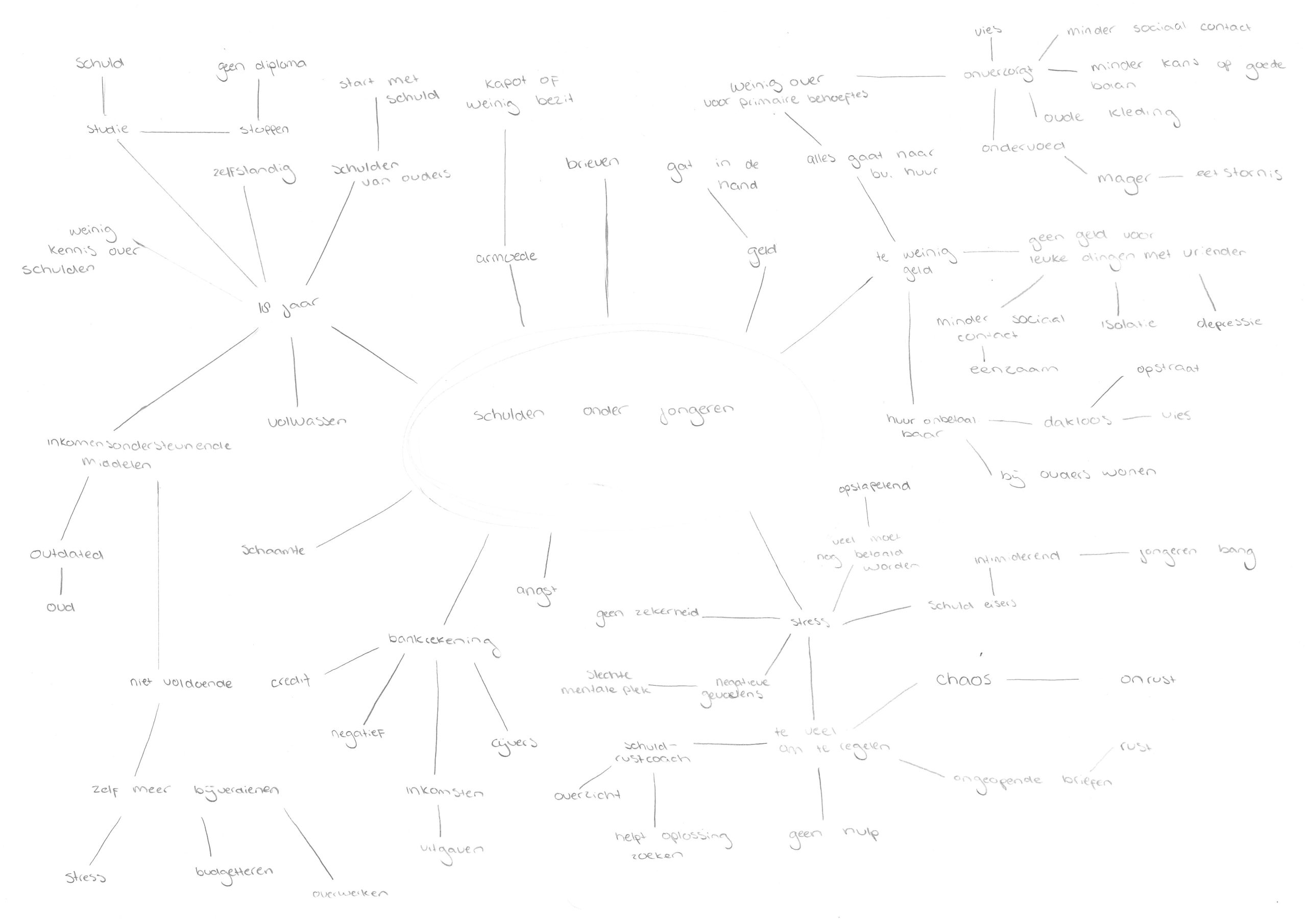
Before starting the actual designing I need to get a better understanding about the subject. I do this by making a mind map, this not only helps gather thoughts but gives me ideas aswel.
Design
After gathering ideas I started making potential lay-outs for the spreads and cover, as well as several wordmarks. The presented ones are just a few of them.
Final product
Wordmark
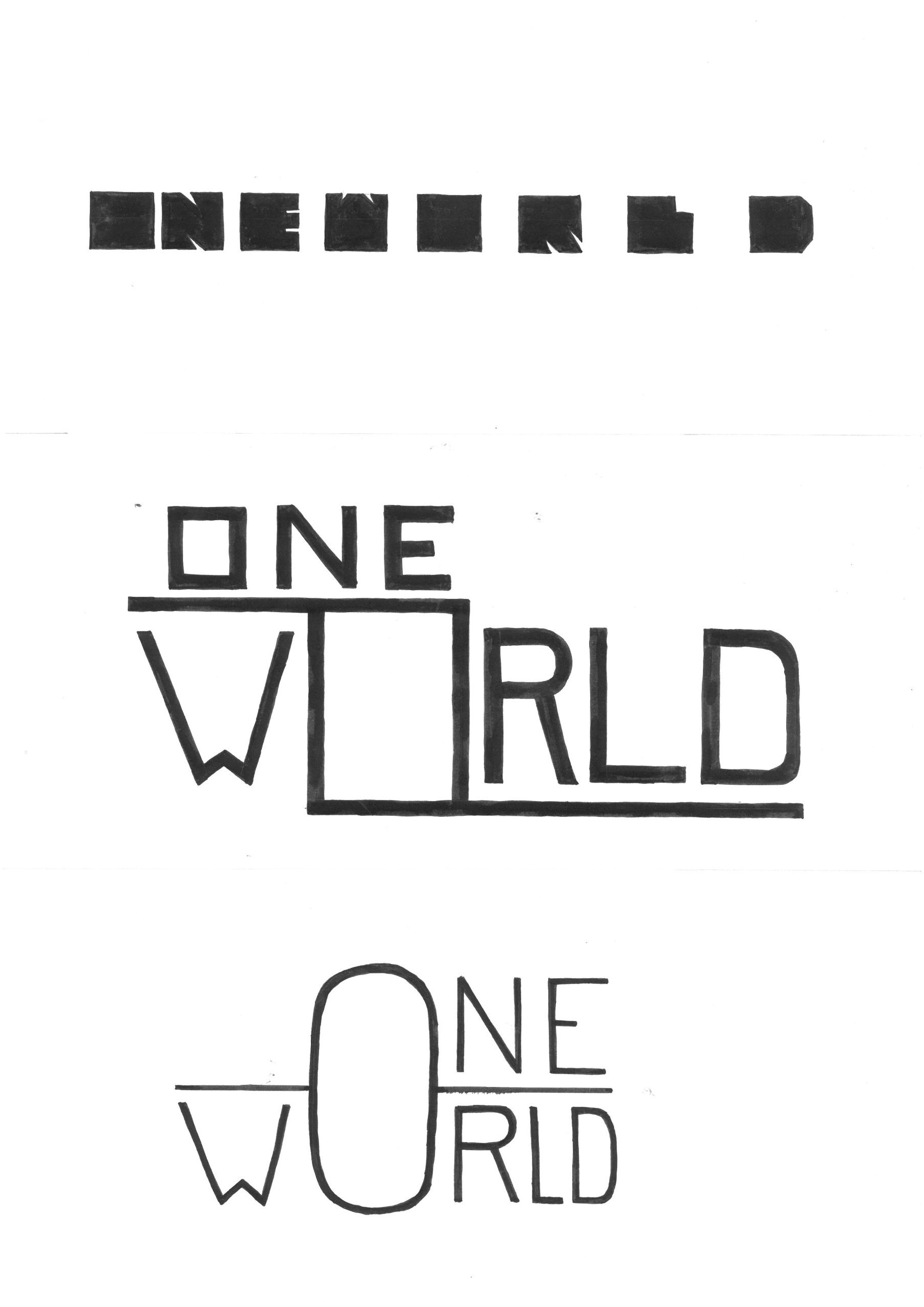
I needed to choose one of the given brand values. I chose “Grensverleggend”, which directly translates to “Boundary Moving”. To this brand value I connected associations which I used to make different versions. This final design fitted the brand value best, the space between te letters could be seen as a boundary that keeps getting moved further. You need to be strong to move a boundary, thats why the letters are bold and square, to match that idea.
✷ Illustrator
Cover
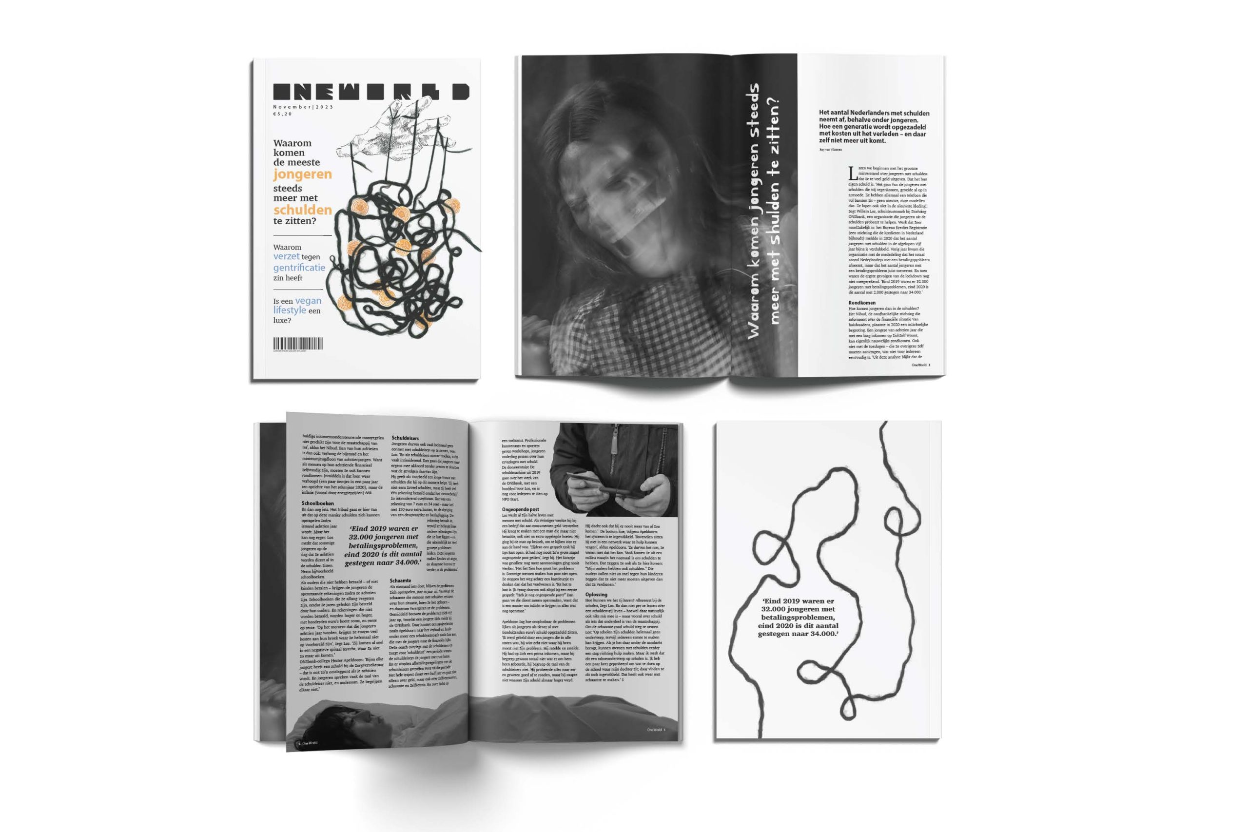
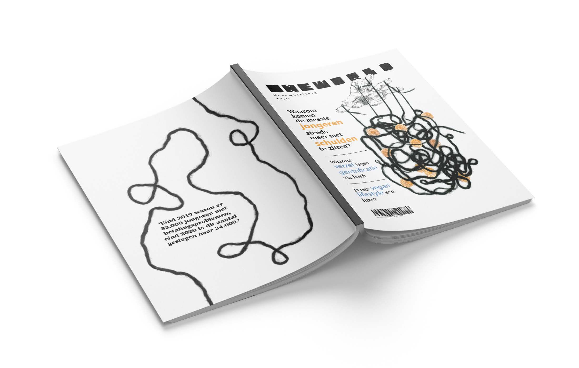
For the cover of the magazine I was assigned to make an illustration that was fitting with the chosen article. The string with money symbolises the messy and difficult situation the youth is in, the hand “controlling” that mess is the dutch government, because they have the ability to worsen or better their financial state.
I myself am not at all happy with this cover, I was obligated to use the body text used in my spreads. I do not think this fits my logo nor the illustration at all. I also think I am capable to make a better composition, since making this I have learned many new things that would be helpful to make this cover what it deserves to be.
✷ Photoshop, InDesign
Openings spread
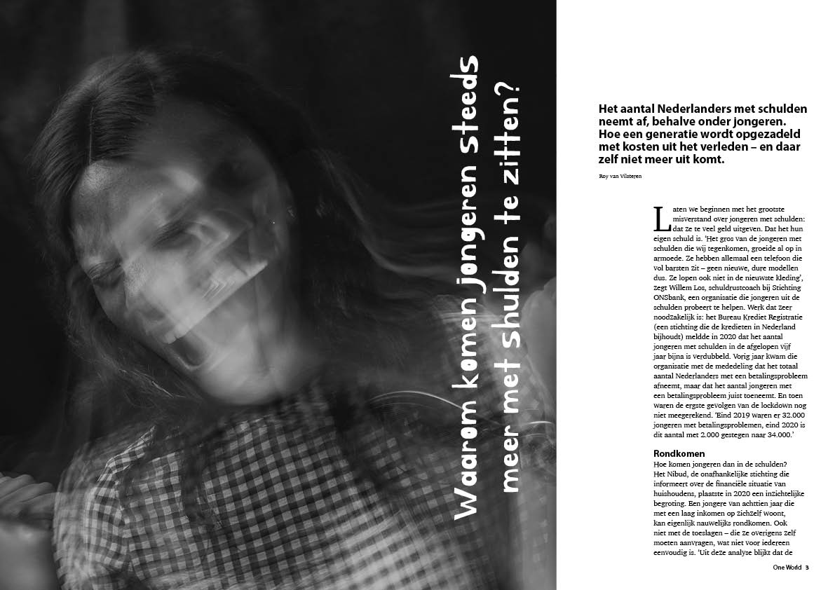
With this spread I went trough a lot of trial and error since it was my first time using InDesign. I chose an unpredictable chaotic typeface for the heading to resemble the chaos and uncertain future of the youth regarding finances. To fit with that I chose a picture of a seemingly distressed young woman.
✷ InDesign
Follow up spread
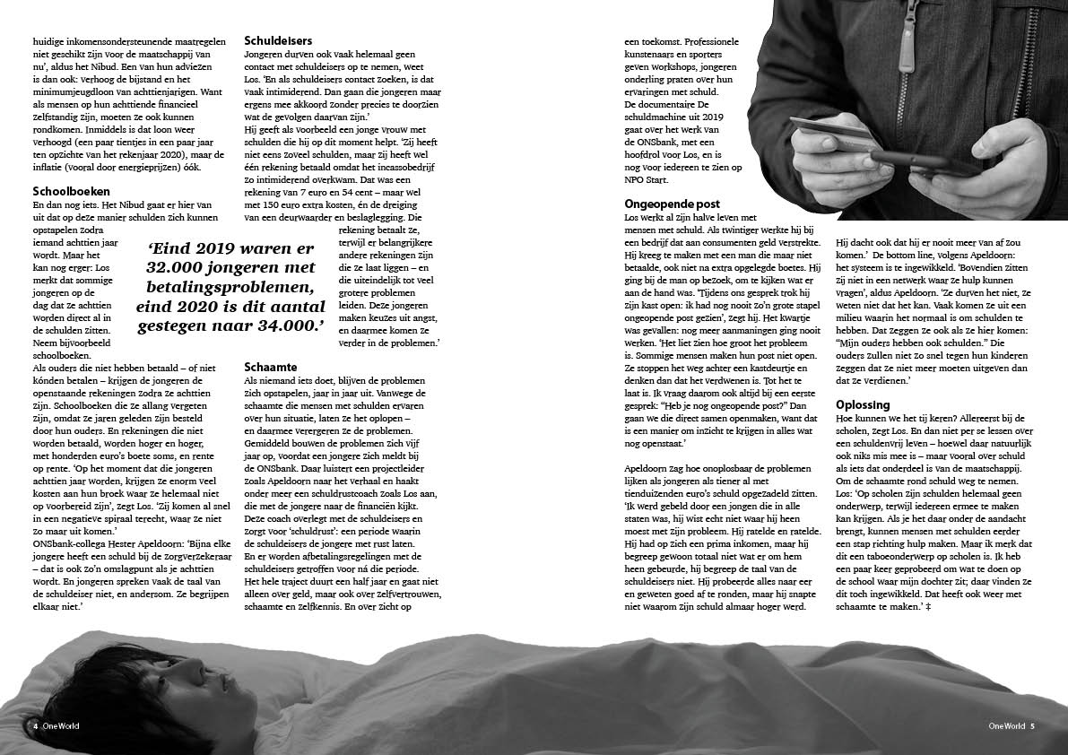
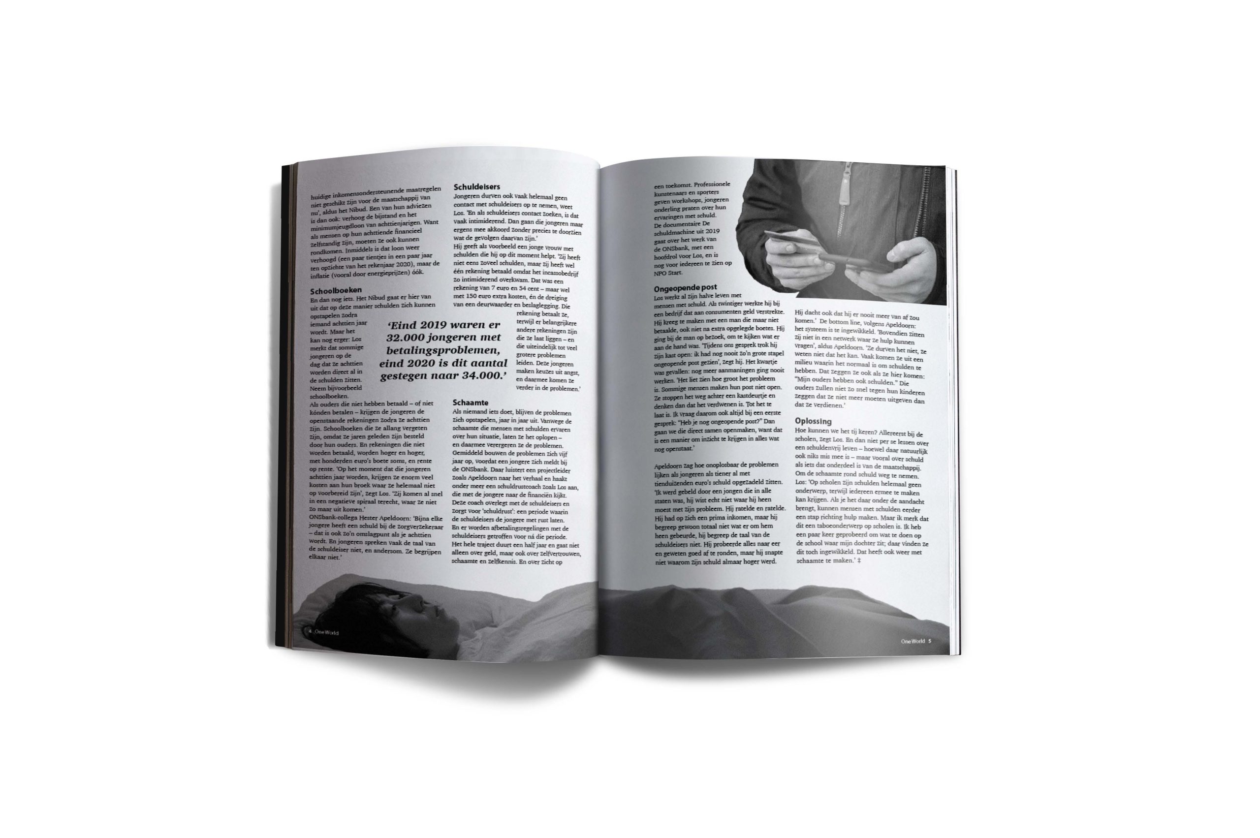
The pictures on this spread flow over the page, this makes it more interesting to look at and gives the reader room to imagine what the full picture would look like. I left a row of whitespace on both sides of the spine, this gives a little rest to the page. I made both spreads in a black and white contrast, I did this to reflect the serious and sorrowful topic.
I am very pleased with my spreads, I think I didn’t do too bad for my first time!