This is the third assignment I had to complete in my first year. I was assigned to re-create a visual identity, logo, day paper, and an app prototype based on a certain brand identity using experiments.
Process
Research
To get a better understanding of the festival I did some research using head and sub-questions. With that knowledge I chose the brand identity Diversity.
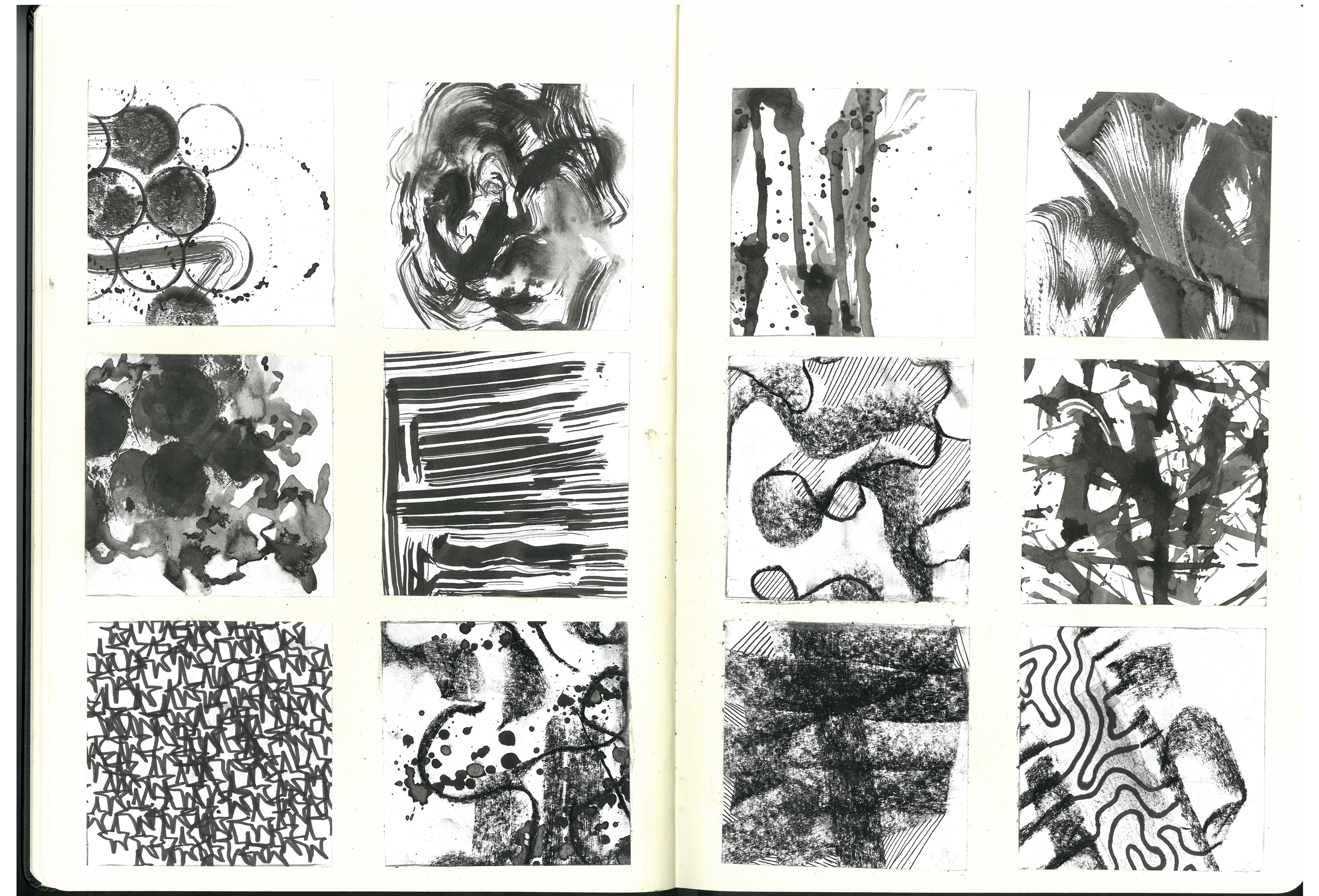
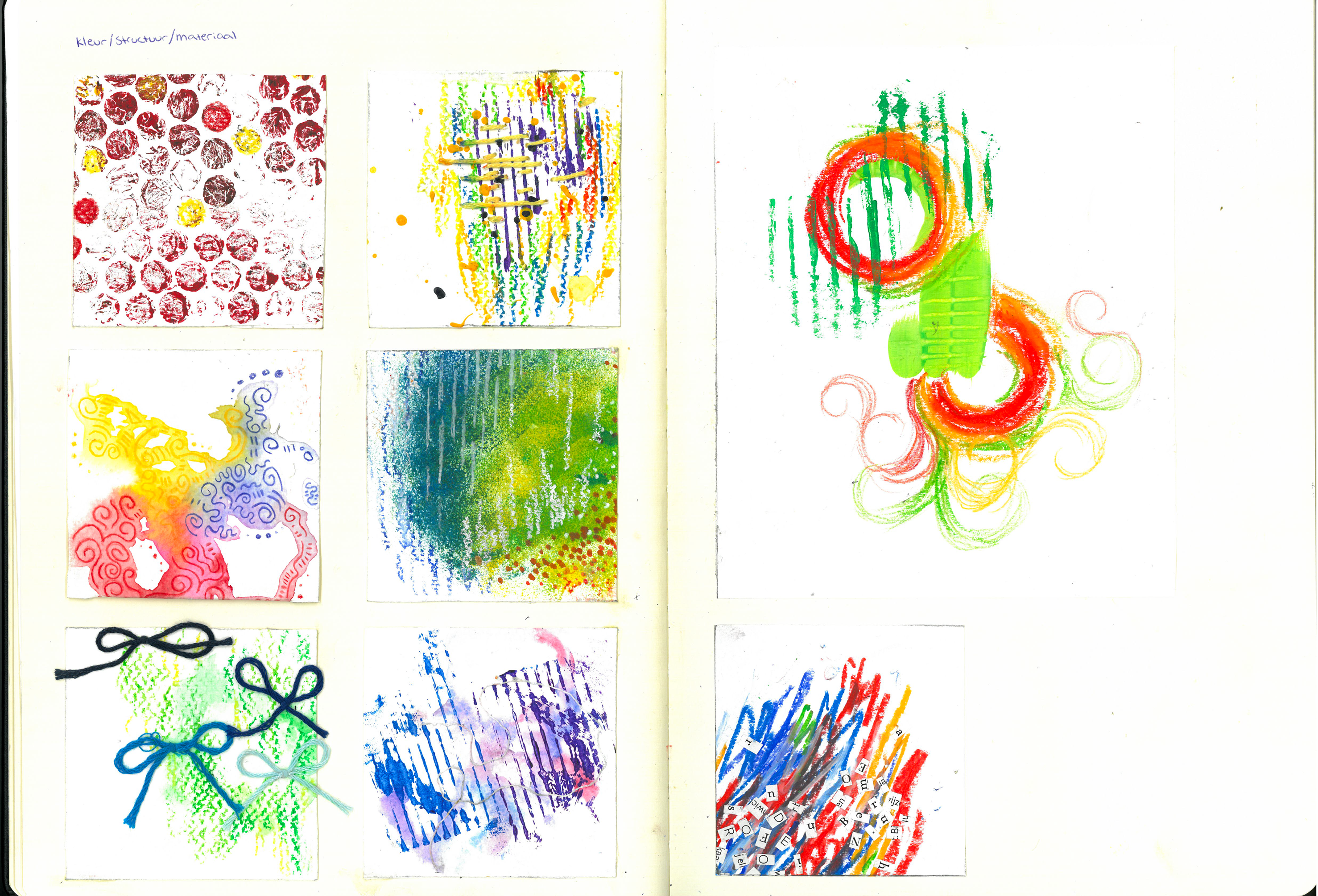
I started with making experiments with Diversity in mind. I used a ton of different materials for this.
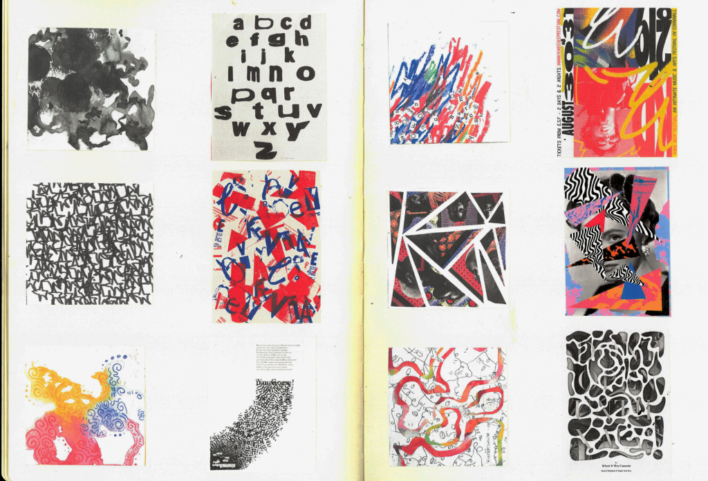
After making the experiments I linked two per category to existing designs to give myself an understanding of what the visual identity could look like.
Realisation
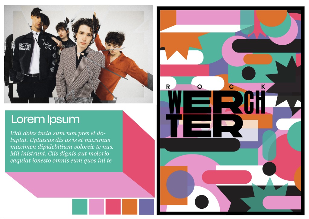
Brand Identity
I made some messy test identitys and chose this one since it fitted Diversity and the festival vibe best.
Logo
This is the logo i designed, the different letters within a rectangle symbolise diversity and the way everyone is together at Rock Werchter.
✷ Illustrator
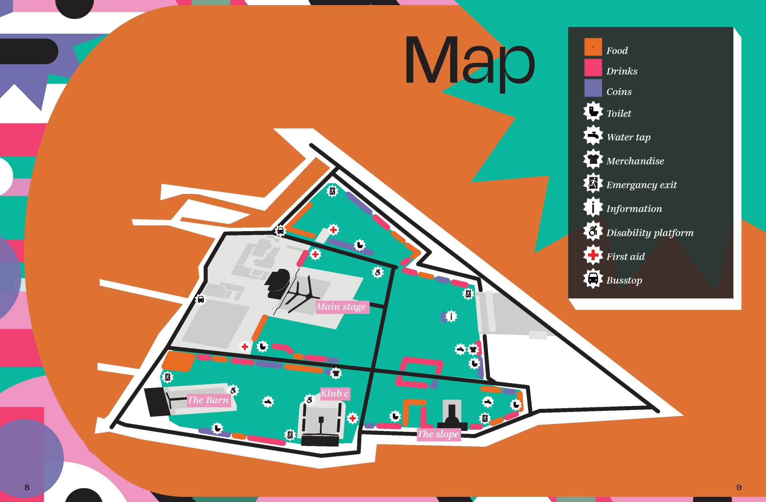
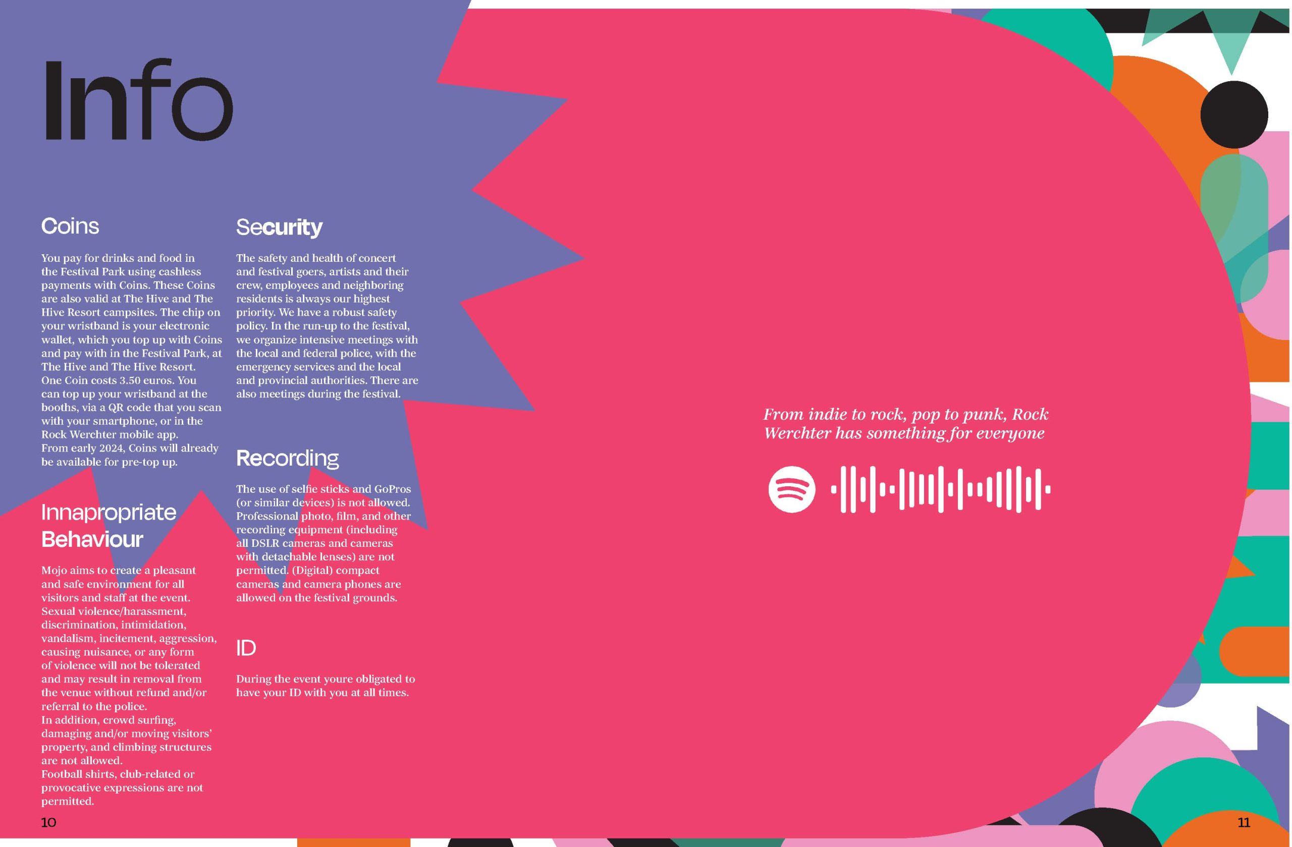
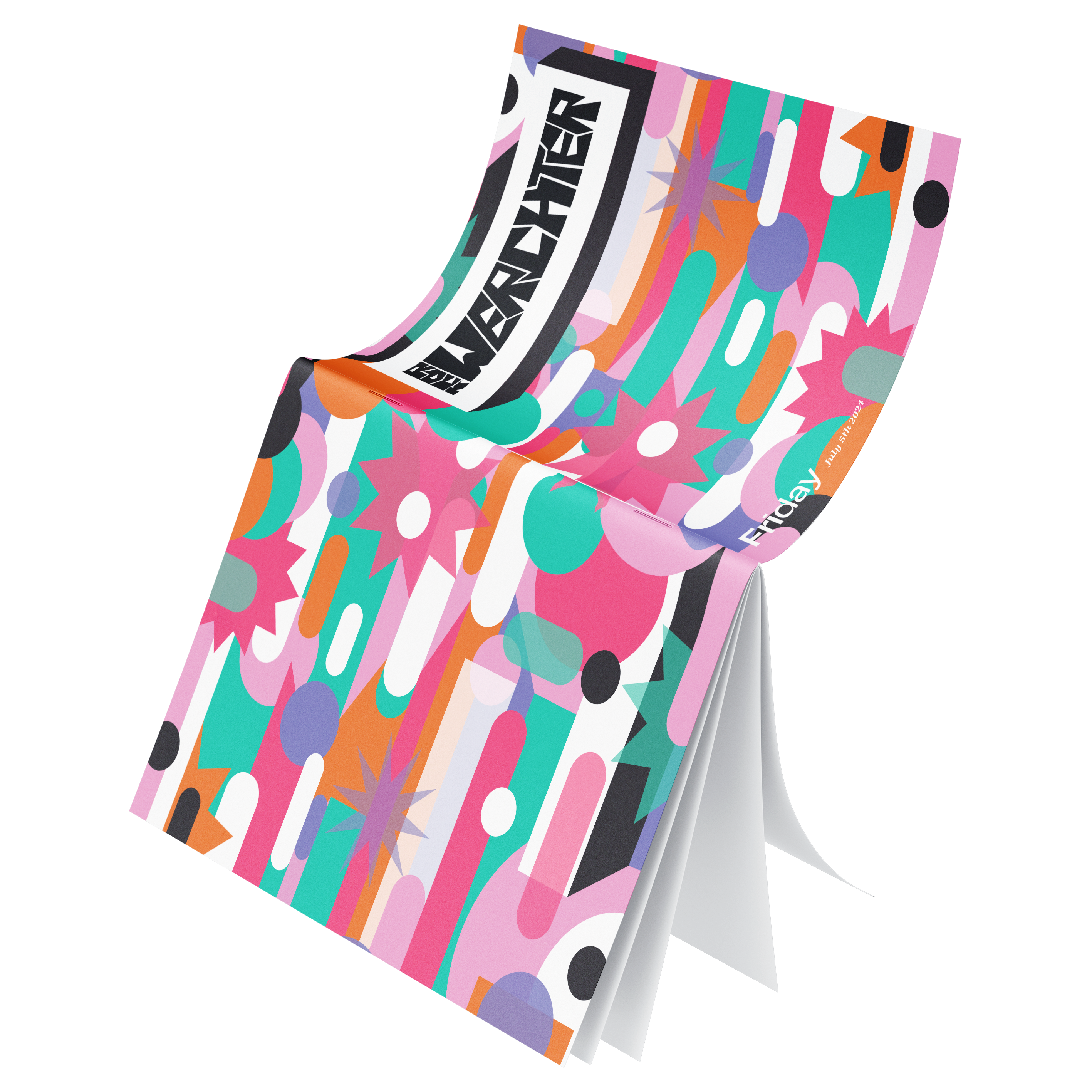
Day Paper
The final day paper; I’m not happy with the cover because I can do better, I’m planning on remaking it soon!
✷ Illustrator, Indesign
App
This is the app prototype, I again used the visual identity for this, and am not mad at the result! It’s a working prototype with not a lot of clicks and fitting with the new brand identity.
✷ Xd
Reflection
I LOVED this project! I liked the different things I had to make and really enjoyed the difficulty of making a new brand identity!
I learned a lot about planning and time management, the adobe apps, and many more things.